


What’s the first thing you notice about a quilt…
Is it the fabric…the color…the design or is it the colors of the design in the fabric???
.
.
Well, most likely it’s ALL of these. I think the Secret to a Stellar Quilt is COLOR!!! It’s what catches our eye and makes the design and fabric come to life!
Today’s post is about color theory……I know, I know…. it’s scary and exhausting to think about. I’m going to tell you about some basic principles of color theory, so you can add it to your quilting tool belt. Understanding a little about color theory can go a long way with a quilter. So…..here we go.
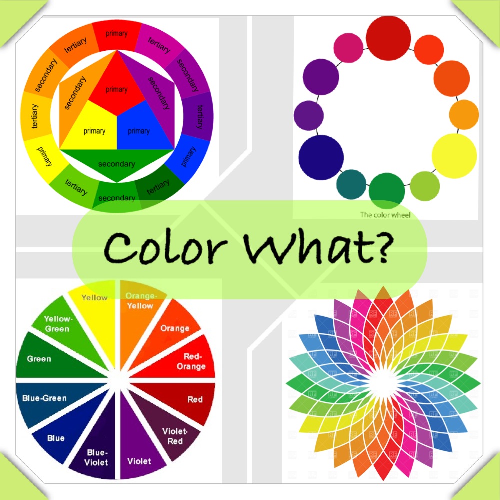
What are these things anywho?
col•or wheel
noun
a circle with different colored sectors used to show the relationship between colors.
That’s pretty simple right?
Let’s look at some color relationships that you’ll find in the Wheel of Mystery(aka-color wheel).
Rule: If it looks good in nature, it looks good anywhere!
After all it was designed by the greatest artist EVER:)

.
.
.
Why do we love the ocean so? It’s beautiful shades of one color.
Monochromatic– many values within one color hue.
Ahh, so relaxing.
.
.
.
.
.

Or a beautiful sunrise or sunflower?
Analogous– 3 colors next to each other on the color wheel.
Creates a smooth, rich effect that blends.
.
.
.
.
.
.


.
.
Complementary Colors- opposites on the color wheel.
Very bold, vibrant and have a POP! factor.
.
.

.
.
.
Split Complementary– opposite on the color wheel, but split on one or both sides forming a triangle(triad) or square(tetrad). Great when you need some harmony!
So how do I use these in my quilts?
Well, if you have a fabric you love, but don’t know what to do with it—-pick out some of the colors in it and see where it fits in the color wheel!
Look at the colors beside it for something to add richness(analogous) or stay right in one spot and see if monochromatic suits your fancy. Maybe, go opposite on the wheel for a fabric that really pops! Let’s say you have a project where one color seems to be taking over>>>>look to the triangle or square shapes in the wheel for a couple fabrics you can throw in to even it out a bit.
Here is a great website to check out for awesome color palettes to browse:
Just look at these gorgeous color palettes!!! If you can’t find inspiration here, you ain’t gonna!


Visit PlayCrafts and check out their awesome palette builder where you can create a palette from your own photo! (cool right?)

A few tips for a Stellar Quilt
1. Avoid overly matching fabrics!
2. Use a fabric lighter or darker than the others for an accent fabric.
3. Use shades within a hue to coordinate, try removing the ones that match exactly.
4. Don’t forget Neutrals/Duller fabrics! We don’t usually see these at first glance,
but they are what make the brighter fabrics sing:)
5. If not sure how it’s looking, use your camera to take a black&white photo to check out contrast.
These are not rules, just helpful thoughts and ideas for your inspiration. I hope the color wheel is a little less scary and can now help you out when your staring at that piece of fabric you love and have no idea what to do:)
So, go get you some inspirational fabric, photo, or one of these lovely palettes and get to quiltin’
Keep it Sassy♥
Links:


